COLOUR STUDY
The study of colour is one of the fundamental elements when enhancing the external architectural surfaces of a building, but it is not the only one. The study also aims to verify if it is necessary to resolve any potential problems with the building by playing with various shades of colour. Colour is fundamental for perceiving areas: it makes the atmosphere welcoming and entices people into certain activities.
MORE INFORMATION
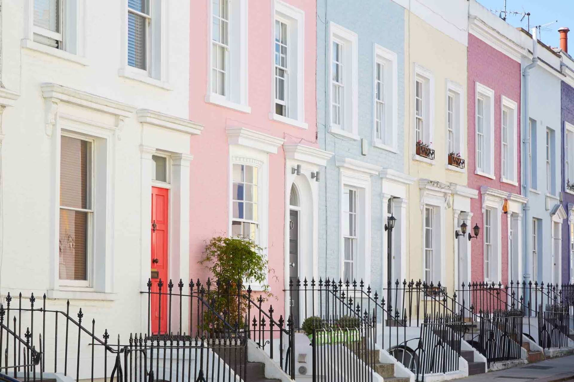
OUTDOOR COLOURS
Chromatic study is one of the fundamental elements of enhancing the external architectural surfaces of a building. The study must consider; the surface painted, the sunshine and the exposure to it during different seasons and at different times of the day. Light has a significant influence on colour: a shaded facade will look different to one in the sun. Just as a facade lit up in the morning by the cold morning sunlight will look different to one lit up by the warm afternoon sunlight. It must also consider the wall’s materials such as blinds , windows, parapets, eaves etc. and the client's personality and tastes, so that the exterior can depict them.
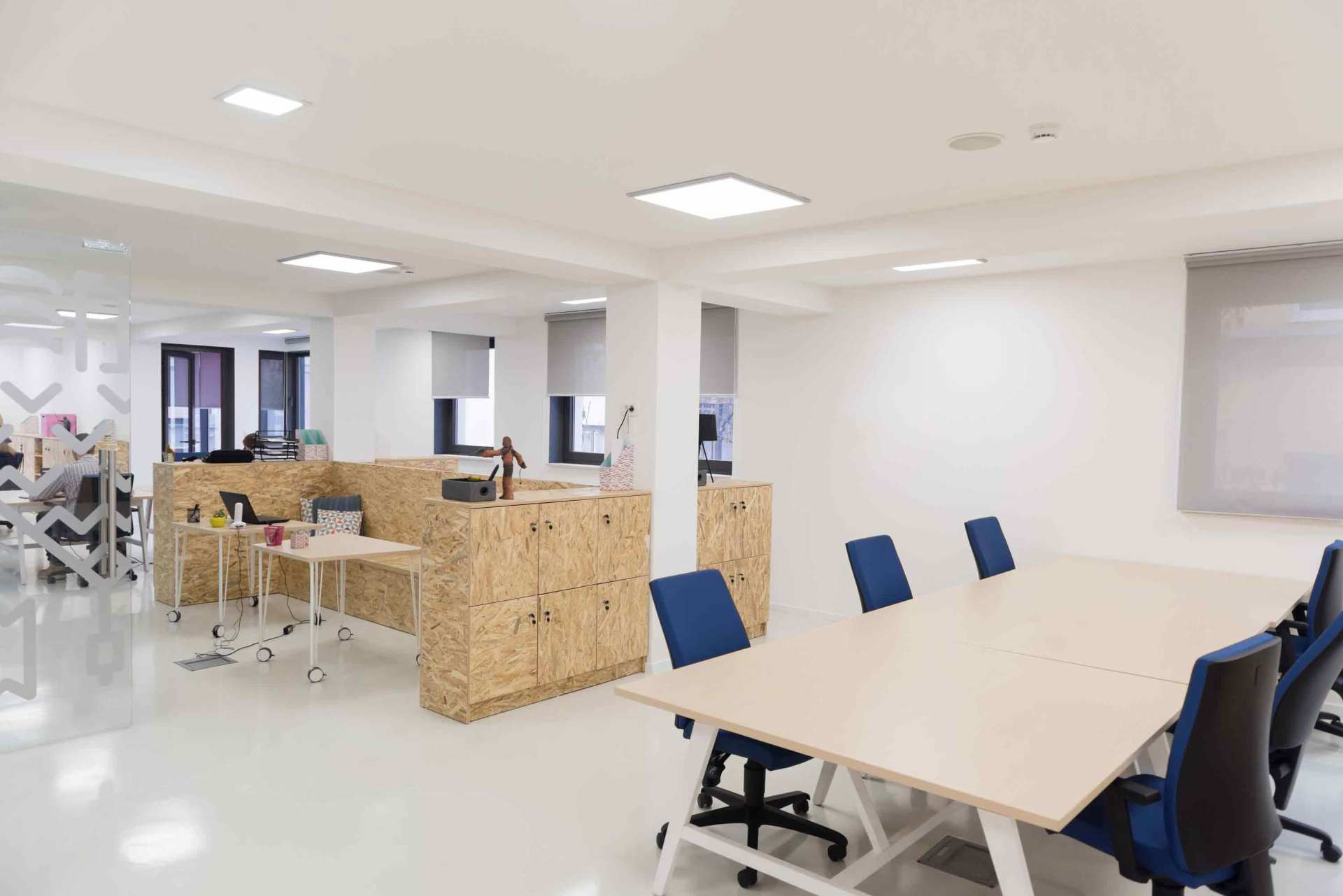
INDOOR COLOURS
Colour is seen as a means of creating emotions and adding colour to life. Colour affects our perception of the environment, its dimensions but also its colour temperature. Colour can influence behaviour (colour psychology): there are colours that promote sleep, concentration, appetite, conviviality….
In residential environments, colour is fundamental for how we perceive areas, rendering a welcoming atmosphere and enticing users into certain activities, like rest, study, conviviality, lunch etc. In commercial environments, colour is used to enhance the product and its perception, in order to best welcome and intrigue customers, encouraging them to enter and stay in a restaurant. In tertiary environments, as well as in schools, colour is used to increase visual comfort and improve concentration and productivity. Finally, in religious environments, colour takes on a mystical and symbolic role, capable of enhancing space and facilitating recollection. The study also aims to verify whether it is necessary to correct any potential problems in the area (it appears too low or high, wide or narrow, it is dark or too bright, it is abundant in furnishings or is bare); something that can often be resolved by playing with the shades and colour combinations. The study takes into account the natural light that enters rooms, distinguishing whether it is warm afternoon or cold morning light, and it calibrates the colours of surfaces by considering the elements present ( fixtures, floors, furnishings, fabrics, etc.). The study is just like a chromatic path that combines different environments considered as a harmonious whole.